This is my class project for the UX Design Professional Certificate.
“Everything a traveler needs to know in one place”.
The product
The focus
An app where people can find information about locations, find things to do, learn from travel tips, and read reviews. It’s like a combination of Reddit, FourSquare, and Yelp.
The problem
It’s hard to figure out what to do and see in a place you don’t know. Or maybe you don’t know where you want to travel at all. You have to scour the internet to find all the information you need.
The goal
Create an app with great sorting features to make finding interesting places easy. Include a robust review system, and the ability to create posts with travel tips, and you have an app that covers all a traveler’s information needs.
User research summary
Using the journey maps I learned that I did not want to build a booking app. I wanted this to be more like a forum for users to find information, share experiences, and learn about new places.
My competitor research showed there are plenty of travel information sites already. Foursquare is a once popular site, so it was interesting to research them and avoid their mistakes. I really enjoyed AirBnB’s aesthetic.
User research showed me how complex the application looked to other people. It helped me to think more deeply about how to make the flows easier to understand for everyone that uses the platform.
Pain points
- How do you choose where to travel? Once you decide where to go, where to you stay? How do you get around? Planning a big trip is hard.
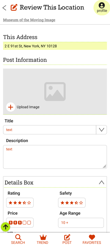
- Travelers run into problems and want advice from people with similar experience.
- Travelers want information about accessibility and safety to feel comfortable when traveling.
- Where do travelers find information about activities like like hiking, and about places like National Parks.
Problem statement
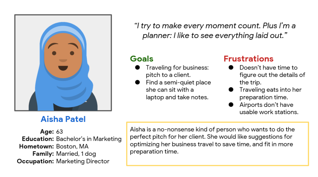
Aisha is a marketing director who needs to get work done while at the airport because she doesn’t have much time to spare.
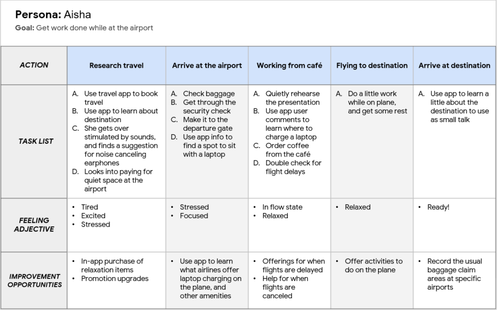
User journey map
I felt it was important to plan for frequent travelers like those who travel for business. This way you can find tips from other users to make your trip go smoother.
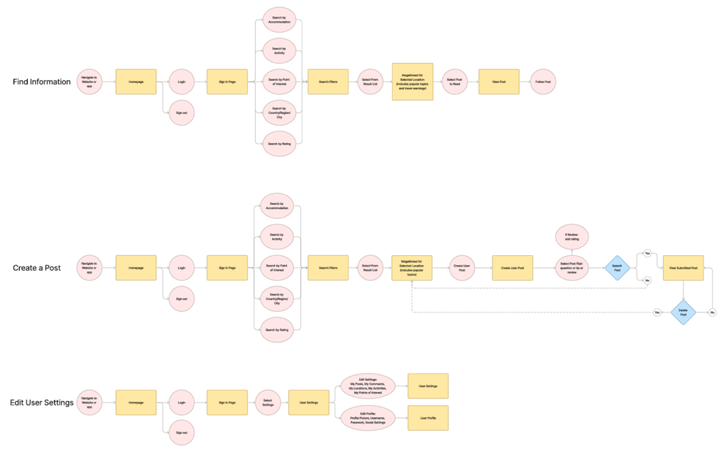
User flow map
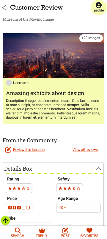
I wanted to make it easy to find travel information, but the way I did that evolved as I worked. The core feature of the app was always the search filters, but now there is also user forums, user reviews, and business profiles.
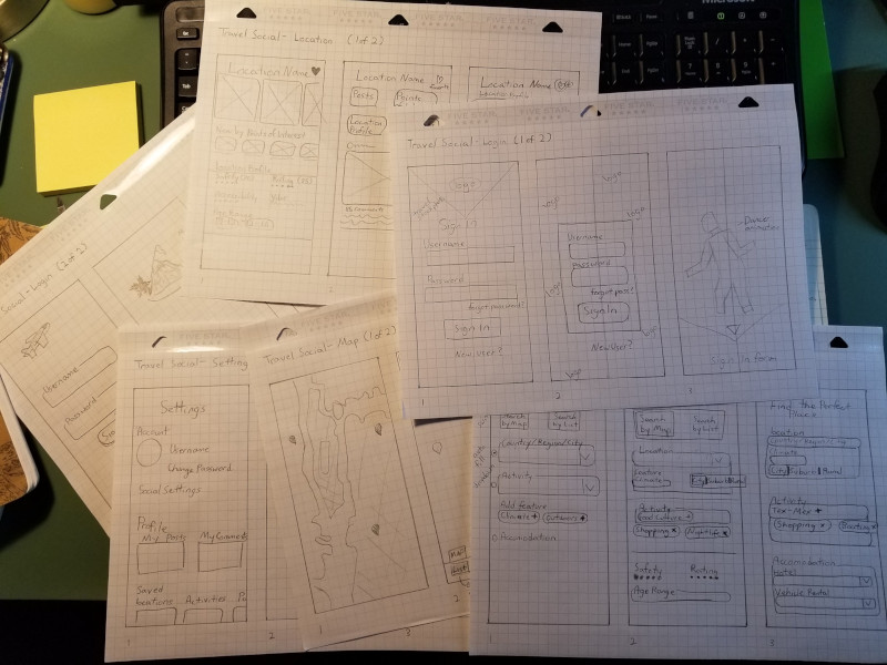
Paper wireframes
Balancing how much control to give users is tricky. Too much control and you have an application that is overly complicated to the point it’s unusable. I spent a lot of time refining the features to give users an approachable platform that offers a lot of information.
Digital wireframes
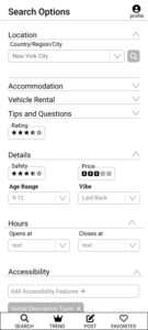
The search filters needed to be robust enough to narrow down tons of options so it is easier to choose one.
- Tips and Questions: you can search by other people’s posts to find personal accounts, advice, and more.
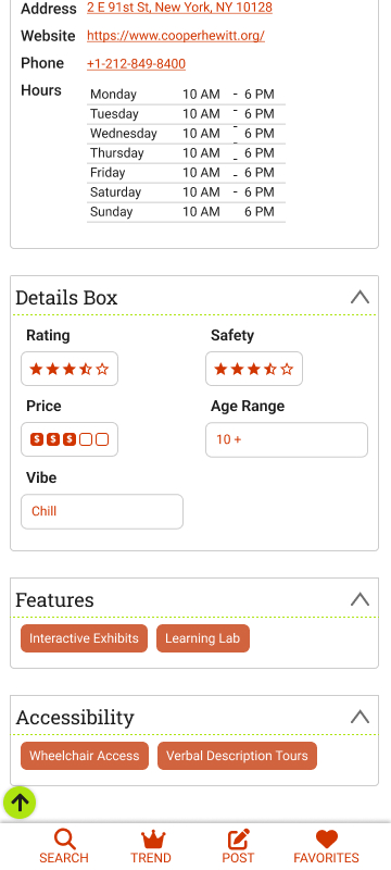
- Details: these let you search for locations where you’ll feel the most comfortable.
- Accessibility: I don’t know of any other platform that lets you search by accessibility features!
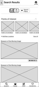
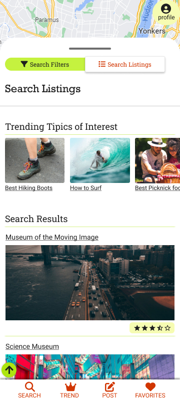
Search Results are the most important part of the application. Find what you’re looking for, and what you didn’t know you were looking for!
- The switch lets you go back to the map to view where the locations are.
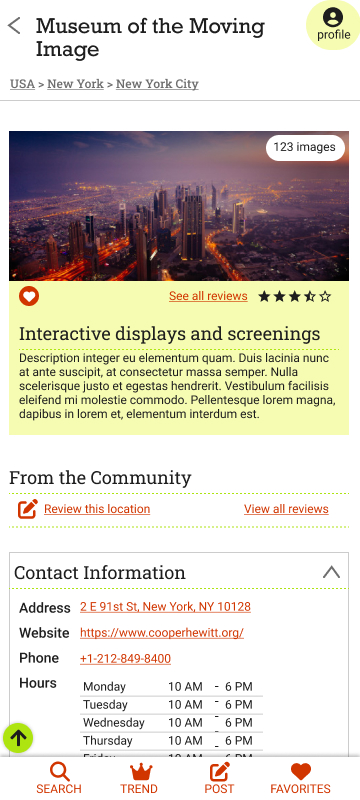
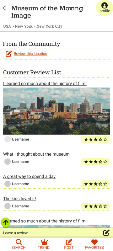
- Search listings plus ratings so you can get a feel for a location before you click.
Low-fidelity prototype
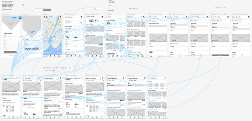
So many pages, so many connections. Much of this got cleaned up, but getting there was a process.
Mockups
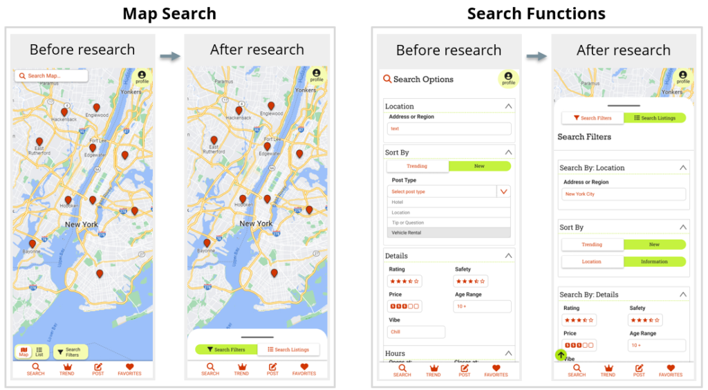
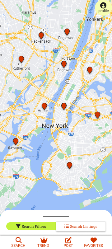
Map Search page
These buttons had to be reorganized and simplified. Since it added a draggable popup, the search map field could be removed since the search filters were right there. The view toggle could be made bigger. The new layout is now easier to understand.
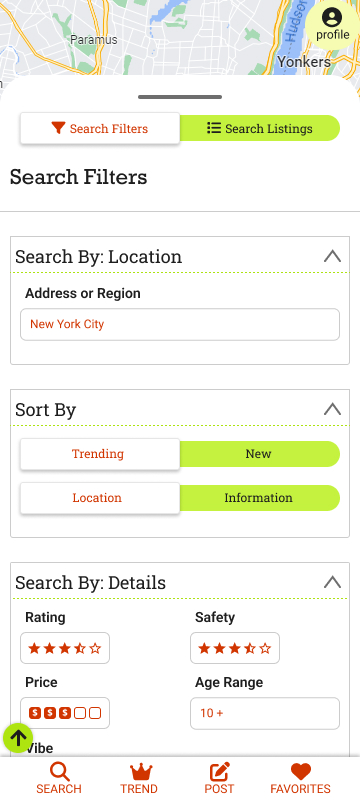
Search Features page
I realized this page was confusing, so this is what changed the most. I improved the heading labels, changed the Post Type field to the Location/Information switch, and changed this from a page to a draggable popup.
